Travis
-
Content Count
2,240 -
Joined
-
Last visited
-
Days Won
3
Everything posted by Travis
-
Apparently Commodore is sticking with #22. Also, Ian White is going to don #18. Interesting. Source: Winging It In Motown
-
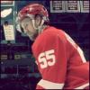
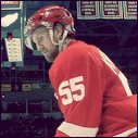
Abdelkader - Helm - Eaves
-
Scott Burnside, ESPN.com
-
Scott Burnside makes his case for Chris Osgood - ESPN.com
-
They're renaming Versus again?
-
The Best of Kris Draper | freep.com
-
I feel like it had to have been.
-
He was more of a Maltby type in Detroit than an out-and-out ******. The only thing that I remember about his time in Detroit was that it seemed like he got himself roughed up a lot.
-
I saw the replay, haha. That was a really big flame for him to not notice. Good start to this road trip by taking 3 of 4 from Minny. Remember when going to Minnesota was an inevitable series loss? So glad the Metrodome is gone. This White Sox series is easily the biggest series of the year to this point. I'm glad that schedule worked out in such a way that we are essentially wasting their ace by pitching our #5 against him. Hopefully the Tigers are patient against Buehrle and don't feed into his quick style.
-
1) Who is your favorite Detroit Red Wing player overall to wear the Red Wings Logo? Brendan Shanahan 2) Who was your favorite Detroit Red Wing player that joined the red wings? (Non drafted by Wings, could be threw Trade / FA / Waiver etc...) Brendan Shanahan, or Marian Hossa 3) Which current player would you dream of them joining the Wings? Shea Weber or Ryan Kesler 4) Which are the players that really "hurt / bugged" you when they left the Red Wings to join another team? Sergei Federov 5) Is there a player that you never wanted him on the team ... but eventually joined the team? Chris Chelios
-
It's like the relationship between a square and a rectangle. But I agree, though.
-
The use of the maple leaf calls back to old Royal Canadian Air Force flier patches. As seen in the ideation portion of the brand book that they posted on the website. You can see the theme repeated throughout the logos seen on the page. To me, it just reinforces how badly they missed the mark. They tried to create a vector update of a classic looking badge and included only enough detail to put on display how much detail it truly lacks. It appears unfinished. I don't know why it doesn't say Winnipeg Jets Hockey Club around the crest, either. It honestly looks like it was put in the hands of someone that isn't strong with Illustrator.
-
Yeah, the Wings aren't really quick to hang jerseys in the rafters. I think the only number we'll see in the rafters any time soon is #5. If Zetterberg remains a Wing for his entire career, I think he probably earns a spot up there - but I don't know that we'll be seeing others for awhile.
-
Not really sure what graphic design and fashion design have to do with one another but, I'm finishing up my BFA in Graphic Design as we speak, so I'm extra critical on matters like this. Honestly, though, their just poorly executed. I had high hopes for the new Jets brand and am disappointed in what came out of it.
-
I mean, that's obviously the direction they were going - which I appreciate - but it could have been much more well executed. They have posted their brand identity on their site. The first slide showing the start of their ideation is a great direction, but displaying that just proves how far off the mark they hit. They did a really poor job of trying to 'update' the crest in the upper right hand corner of the aforementioned slide. I'm woefully unimpressed by all of it. Maybe they'll do some really classic looking jerseys, but I a strong feeling that they'll try to create and 'updated' version of those, too.
-
It really is. I think amateurish is probably the best way to describe it. They completely missed the mark with these logos. I can understand some of the thinking behind the symbolism, with the pilot wing secondary and the northern-compass mark on the main logo - but they just failed. Plain and simple. As if the idea behind the 'jet on the leaf' wasn't lame enough - even the execution sucks. I now have no faith or interest in the jerseys. I was hoping the Thrashers franchise would be freed of crappy aesthetics, but obviously I'm wrong. They would have been better off letting people react to the leak without confirming or denying anything. It would've given them some good insight into fan reaction, which will certainly be negative. Maybe they'll get the 'Gap treatment' and have to call an audible on the logo.
-
Edit: Already posted. This logo set is completely terrible. The 3 aren't even cohesive with one another. I can't decide which is worse, the main logo or the wordmark.
-
Agreed. 100%. Someone suggested the idea that maybe this (seemingly) haphazardly scheduled announcement is a reaction to the leak. Perhaps, though, it's a reaction against the leak so that crappy logo doesn't flood the knock off market.
-
According to SBNation, Dave Strader is doing the same thing.
-
About the logo unveiling? That came from their website. You can see it listed on the ticker. The 'leaked' image came from icethetics twitter account.
-
So much Primeau love in those. Someone actually suggest he should be "untouchable" when it's suggested be traded for Hasek. Hindsight, eh?
-
The Jets will be unveiling their logo this at 5:00pm EST on jets.nhl.com. There are rumors swirling that this is the will be the logo - Here's hoping they are false.
-
Great news that he's health is improving. The game I took my Dad to for his birthday (Wings / Oilers) happened to be one of the games where the Wings' displayed giant Get Well cards in the concourse for people to sign. Happy to have had the pleasure to pass along well wishes.
-
Yeah, just because Detroit is the 'best fit' for Doughty from a standpoint of sensibility and the future, it doesn't have anything to do with reality and certainly doesn't mean anything about the progress of his contract talk with the Kings.
-
That's a really interesting thought. I agree that it's doubtful it was a suicide, but hadn't thought about the possibility of Derek's brother taking his stash as a preventative measure. Despite what their parents say, I sort of doubt that the stories aren't related in some fashion.