CenterIce 83 Report post Posted September 3, 2009 http://www.nhl.com/ice/news.htm?id=497572 Share this post Link to post Share on other sites
Guest micah Report post Posted September 3, 2009 Sweet. Share this post Link to post Share on other sites
GMRwings1983 8,804 Report post Posted September 3, 2009 I love those jerseys. Many teams should go back to their roots. Now, hopefully the Carolina Hurricanes will wear the Whalers jersey as their 3rd jersey. Hell, I'm actually going to complain that the Flames don't make those old jerseys their main jerseys and make this current crap their 3rd jersey, instead of having it vice versa Share this post Link to post Share on other sites
NeverForgetMac25 483 Report post Posted September 3, 2009 I love those jerseys. Many teams should go back to their roots. Now, hopefully the Carolina Hurricanes will wear the Whalers jersey as their 3rd jersey. Hell, I'm actually going to complain that the Flames don't make those old jerseys their main jerseys and make this current crap their 3rd jersey, instead of having it vice versa Those jersey's were sweet. I used to love the rink-and-stick logo of the Canucks with those colors as well. I was happy they kept the colors when they switched jerseys last year, but I was bummed they decided to stick with their current logo. I think the Canuck "C" logo is lame, while the rink-and-stick logo is simply classic! This logo....so Bad-Ass: Share this post Link to post Share on other sites
stevkrause 1,247 Report post Posted September 3, 2009 Those jersey's were sweet. I used to love the rink-and-stick logo of the Canucks with those colors as well. I was happy they kept the colors when they switched jerseys last year, but I was bummed they decided to stick with their current logo. I think the Canuck "C" logo is lame, while the rink-and-stick logo is simply classic! This logo....so Bad-Ass: really was one of the bets jerseys around... too bad their not still in Hartford, because I hate them in Carolina, haha Share this post Link to post Share on other sites
AtomicPunk 296 Report post Posted September 3, 2009 I'm digging it. Used to have a few of those original gamers in my collection. They are my favorite Flames jersey, although their jerseys have always looked pretty good. Share this post Link to post Share on other sites
Doc Holiday 0 Report post Posted September 3, 2009 (edited) Those jersey's were sweet. I used to love the rink-and-stick logo of the Canucks with those colors. I was happy they kept the colors when they switched jerseys last year, but I was bummed they decided to stick with their current logo. I think the Canuck "C" logo is lame, while the rink-and-stick logo is simply classic! This logo....so Bad-Ass: Classic, but stupid. They are not the vancouver hockey rink. Their logo doesn't represent the team, city, or history of the franchise. It represents hockey. Good on the flames for picking a good jersey NOT influenced by Reebok. My idea for a Hurricanes third. Also NOT influenced by Reebok. Edited September 3, 2009 by Doc Holiday Share this post Link to post Share on other sites
GMRwings1983 8,804 Report post Posted September 3, 2009 (edited) Classic, but stupid. They are not the vancouver hockey rink. Their logo doesn't represent the team, city, or history of the franchise. It represents hockey. Good on the flames for picking a good jersey NOT influenced by Reebok. My idea for a Hurricanes third. Also NOT influenced by Reebok. Well, at least it's not red and white. The Canes logo is stupid, though, but I guess you can't blame them because of the team name. Also, you guys will think I'm crazy, but I wish the Canucks would bring back the "V" jersey for just a few games. Why the hell not? They were so bad that they were actually good. Kind of like the film "Battlefield Earth". Oh, and I also agree with NFM that the stick logo is stupid. Also, they should move back to the Pacific Coliseum. That place was like a dungeon. O.K. now I'm getting real picky and showing off my old school nature. I'll stop for awhile. Edited September 3, 2009 by GMRwings1983 Share this post Link to post Share on other sites
Electrophile 3,554 Report post Posted September 3, 2009 While I generally dislike the idea of a third jersey, if the team were to use an old logo as a throwback, that would be neat. Some teams had some interesting logos back in the day and at least that way you're throwing a little history at the kids. Share this post Link to post Share on other sites
dobbles 252 Report post Posted September 3, 2009 i thought the reason that the whalers jersey/logo is never used was because the city of hartford owned the rights and didn't want anyone using it. am i totally out to lunch in remembering that? Share this post Link to post Share on other sites
Cern 0 Report post Posted September 3, 2009 I was happy they kept the colors when they switched jerseys last year, but I was bummed they decided to stick with their current logo. I think the Canuck "C" logo is lame, while the rink-and-stick logo is simply classic! I know that for whatever reason I'm in the minority, but I really like the Canucks current logos and hate the stick-rink. Finally Vancouver has a logo that actually represents some kind of local identity and having it married with the old-school colours provides a good reference back to the team's early years (although that VANCOUVER wordmark needs to go). The rink logo looks like it should be worn by the Ft. Anywhere Peewee Generics in some bad Mighty Ducks ripoff, it's barely representative of hockey let alone the team or where they play. Gotta agree that the Whalers jerseys were freaking awesome though (cooperalls nowithstanding). You can't even get them from the ex-team vintage jersey collection though, apparently the city of Hartford still owns the logo so the league can't make merchandise of it. Share this post Link to post Share on other sites
AtomicPunk 296 Report post Posted September 3, 2009 Doesn't the current Vancouver "C" / Orca logo represent the old ownership group? They no longer own the team, so why are they represented on the jersey? Just seems silly. Share this post Link to post Share on other sites
Cern 0 Report post Posted September 3, 2009 Doesn't the current Vancouver "C" / Orca logo represent the old ownership group? They no longer own the team, so why are they represented on the jersey? Just seems silly. They do still own the team. Share this post Link to post Share on other sites
thedisappearer 291 Report post Posted September 4, 2009 i thought the reason that the whalers jersey/logo is never used was because the city of hartford owned the rights and didn't want anyone using it. am i totally out to lunch in remembering that? I have heard this as well. Share this post Link to post Share on other sites
NeverForgetMac25 483 Report post Posted September 4, 2009 Classic, but stupid. They are not the vancouver hockey rink. Their logo doesn't represent the team, city, or history of the franchise. It represents hockey. Good on the flames for picking a good jersey NOT influenced by Reebok. My idea for a Hurricanes third. Also NOT influenced by Reebok. So what? All I was saying is that its a bad-ass logo....regardless of what it represents. Well, at least it's not red and white. The Canes logo is stupid, though, but I guess you can't blame them because of the team name. Also, you guys will think I'm crazy, but I wish the Canucks would bring back the "V" jersey for just a few games. Why the hell not? They were so bad that they were actually good. Kind of like the film "Battlefield Earth". Oh, and I also agree with NFM that the stick logo is stupid. Also, they should move back to the Pacific Coliseum. That place was like a dungeon. O.K. now I'm getting real picky and showing off my old school nature. I'll stop for awhile. You must have miss-quoted me, because I like the rink-and-stick logo. Doc was the one who thinks its stupid. Share this post Link to post Share on other sites
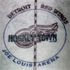
Guest micah Report post Posted September 4, 2009 Offtopic, but I really hope the Wings will play in thses again someday for a throwback event or use them as a 3rd: Share this post Link to post Share on other sites
GMRwings1983 8,804 Report post Posted September 4, 2009 So what? All I was saying is that its a bad-ass logo....regardless of what it represents. You must have miss-quoted me, because I like the rink-and-stick logo. Doc was the one who thinks its stupid. Yeah, I guess I did misquote you. Sorry. I like the "V" logo the best. I think it'd look great with cooperalls. Don't know if they'd need league approval to wear cooperalls, though. Share this post Link to post Share on other sites
Doc Holiday 0 Report post Posted September 4, 2009 So what? All I was saying is that its a bad-ass logo....regardless of what it represents. You must have miss-quoted me, because I like the rink-and-stick logo. Doc was the one who thinks its stupid. It's not. Really, really not. Too simple of a design (first graders could have designed that), doesn't represent the team in any way shape or form. What can you get out of that logo that is positive? Share this post Link to post Share on other sites
Cern 0 Report post Posted September 4, 2009 I like the "V" logo the best. ewwwwwwww Share this post Link to post Share on other sites
GMRwings1983 8,804 Report post Posted September 4, 2009 ewwwwwwww What? It's beautiful in an ugly way. I think it'd look great with black cooperalls. Just for a few games or so. Share this post Link to post Share on other sites
Cern 0 Report post Posted September 4, 2009 Offtopic, but I really hope the Wings will play in thses again someday for a throwback event or use them as a 3rd: Are those the Victoria sweaters? Doubtful they'd ever see the light of day since the league dosen't recognize them as part of the Wings' franchise but who knows. Share this post Link to post Share on other sites
NeverForgetMac25 483 Report post Posted September 4, 2009 It's not. Really, really not. Too simple of a design (first graders could have designed that), doesn't represent the team in any way shape or form. What can you get out of that logo that is positive? It's basic, yet sharp. It's not cluttered and to me its "classic." I like simplistic designs and logos. That doesn't make it wrong, just that I have different tastes than you. You don't like it...fine. I think their current logo is a piece of s***....also fine. Share this post Link to post Share on other sites
Doc Holiday 0 Report post Posted September 4, 2009 It's basic, yet sharp. It's not cluttered and to me its "classic." I like simplistic designs and logos. That doesn't make it wrong, just that I have different tastes than you. You don't like it...fine. I think their current logo is a piece of s***....also fine. There is a difference between liking different logos and thinking a rounded square with a stick in it is an acceptable logo. Share this post Link to post Share on other sites
dobbles 252 Report post Posted September 4, 2009 There is a difference between liking different logos and thinking a rounded square with a stick in it is an acceptable logo. its all preference. what if i were to replace 'rounded square with a stick' with 'wheel with a wings on it' how would that go over? you can't make other people like/dislike what you want them to. just as no one can get you to change your likes and dislikes. Share this post Link to post Share on other sites
Doc Holiday 0 Report post Posted September 4, 2009 its all preference. what if i were to replace 'rounded square with a stick' with 'wheel with a wings on it' how would that go over? you can't make other people like/dislike what you want them to. just as no one can get you to change your likes and dislikes. Because the Wings logo is more than simple shapes. That is my point. The Canucks logo is a square and stick. Man, ******* groundbreaking isn't it? Share this post Link to post Share on other sites